Direct Booking Widget: visual improvments
Some small visual changes to the booking widget would make it more friendly for users. We regularly receive questions regarding the days available and pricing because of how these two things display in the booking widget.
1. The price per night displayed at the top of the widget is confusing for prospects because it displays an average price for the days available. But the actual prices for the dates that they are interested in my be much higher or much lower. Removing this from the top of the widget provide a better user experience.
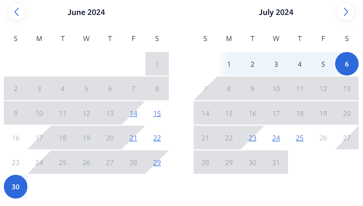
2. The way available dates show up in the booking widget is confusing for prospects because only check-in dates available appear to be available. Once you click on them other dates appear available, but if the prospect doesn't click on a date they may have the false impression that only a few dates are available. A better solution would be to show 3 things visually: 1) dates that are already booked, 2) dates available for check-in and check-out 3) dates available, but not for check-in. VRBO does a good job of showing all 3 of these things clearly. See the picture below:
Making these changes will greatly improve the usability of the booking widget.
Please authenticate to join the conversation.
In Progress
💡 Feature Request
Direct Bookings
Over 2 years ago

Chris Wilson
Subscribe to post
Get notified by email when there are changes.
In Progress
💡 Feature Request
Direct Bookings
Over 2 years ago
Chris Wilson
Subscribe to post
Get notified by email when there are changes.